Accessible Word Documents
Overview
Creating accessible Word documents is often the first step to creating accessible PDFs, web pages, and emails. Understanding how to set up a document for accessibility from the start can save a lot of time down the road. Follow these guidelines and you'll create documents that are not only accessible but well structured, visually organized, and a delight to read.
Check your document for accessibility
Note: the example in these steps uses Microsoft Word, but the steps also apply to PowerPoint and Excel. Get more info on Microsoft's accessibility checker.
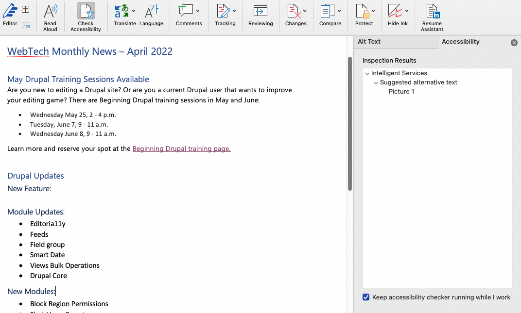
- In the Review tab, choose "Check Accessibility" from the Check Accessibility group.
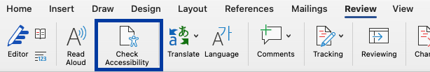
- An accessibility pane will open, with any errors or warnings to investigate. Use the pane to learn more about an issue and how to fix in the Microsoft product you're using.


Use descriptive filenames
A descriptive filename will makes it easier to locate, open, and switch between documents.
Descriptive Filename
WWU-2019-Design-System.docx
Undescriptive Filename
revisions-0x83kdjf934.docx
Use logical heading structure
In Word, headings can be found under Styles.
To view headings in your document, pull up the Navigation Pane, located under the View tab. This will show you the outline of your document.
Styles H1 through H6 (Heading 1 through Heading 6) are best for optimal accessibility, and are best utilized in their respective order of importance.
H1 represents the most important heading, H2 represents the second most important heading, and so on through H6, which represents the least important heading.
Headings - Do:
Use headings to visually highlight different sections of text.
For example, the headings on this page use a different font, are sized different from surrounding text (and each other), and have additional styles to make them visually stand out.
Use headings in order.
H2 should follow H1, H3 should follow H2, etc.
Use headings to logically organize information.
Headings can help break up different sections of text and group similar ideas in a logical way.
Headings - Don't:
Use formatting tools in place of headings.
Assistive technology cannot infer meaning from bold, italic, and underline text formatting.
Skip heading levels.
For example, don't go from an H2 to an H4.
Use headings for aesthetic/design purposes.
Instead, use the Design features of Word to style the logically ordered headings.
Good Heading Structure Example
This only utilizes heading levels 1-3, but deeper heading levels may be used as needed.
H1: Title of Document
Introduction to the document
H2: Section 1
Content for section one
H2: Section 2
H3: Sub-Section 1
Content for section two
H3: Sub-Section 2
More content for section two
H2: Section 3
Content for section three.
Bad Heading Structure Example
This sample skips heading levels, uses headings for formatting, and uses formatting for headings.
Bold & Underline: Title of Document. This should really be an H1
Introduction to document
H5: Reminder: I'd like to highlight this text and make it bigger! But I should do this with the styling tools, not using headings!
H2: Section 1
Content for section one. This heading isn't so bad, but should follow an H1.
H2: Section 2
H4: Sub-Section 1
This section should have an H3
H4: Sub-Section 2
So should this one.
H3: Section 3
I felt Section 3 was less important than section 1 or 2 so I wanted to give it a smaller heading. However, Section 3 does not relate to section 2, so it should really also be at an H2 level.
Updating heading styles
If you don't like Word's default heading styles, you can change the heading appearance using the following steps:
- Adjusting the text's style
- Highlighting the text
- Under the Styles dropdown, right-click the heading level the text should be (heading 1, heading 2, etc.)
- Choose "Update heading x to match selection."
This will update the heading default style to personal preference while maintaining a good heading structure.
Use built-in features to organize content
Manually formatting content through tabs, spaces, and line breaks creates accessibility barriers, because there is no meaning conveyed in this formatting to assistive technology.
Use built in features of Word to organize and visually format content. These features put invisible cues that can be understood by assistive technology to help users navigate the document.
Shift-F1 will pull up a Formatting Pane. This pane shows you the underlying format of your document. It will allow you to check whether or not you’re utilizing the built-in features correctly.
Data Tables - Do:
Use built in list formatting
- Sample list
- Uses built in list format
- Is understood by assistive technology to be a list
This will often happen automatically if the software detects you are creating a list, but you can always use the list features found under the Home tab to ensure the list is created correctly to begin with.
Use columns to break up and organize content
You can do this from the Page Setup (Layout) tab.
When you are using a column layout, you must use the built in column feature. This allows assistive technology to read the content in the correct order, and not skip any content accidentally.
Use layout tables
A layout table does not require row or column headers to describe cell content.
When using layout tables, make sure your reading order matches the visual layout. Also, make sure the table is placed inline.
Use data tables to display tabular data
Place data tables inline.
Data Tables - Don't:
Manually format lists.
- Sample list
- Uses tabs and dashes
- Doesn't have any list formatting
Create the appearance of columns or layout tables with tabs or spaces.
Large amounts of blank space are interpreted audibly by assistive technology, and can be confusing.
Use images of data tables.
Screen readers cannot access the data if it is in an image.
Use complicated data table structure.
Don't use more than one header row, and avoid merging and splitting cells as much as possible.
How to create data tables
- Insert tables using the Table drop down menu under the Insert tab.
- Select number of cells needed.
- Identify the header by selecting the row, then selecting Repeat Header Rows under Table Tools Layout
Use unique and descriptive names for links
Unique and descriptive names for links specify the destination, function or purpose of the link. They allow assistive technology to identify information about the link.
Descriptive Link Text
To apply to the program, fill out our online application.
Undescriptive Link Text
Click here to fill out our online application
How to insert link text
- Under the Insert tab click on Hyperlink
- An “Insert Hyperlink” box will appear allowing you to insert the text you wish to make into a link, and the link itself.
- In the space provided for “Text to display”, insert your link text. Make it unique and descriptive!
- Insert your link in the space provided for the “Address”
- Click Okay
Duplicate important information in headers, footers, and watermarks
Screen readers do not automatically read information in headers, footers, and watermarks. Therefore, it is the author’s responsibility to ensure that vital information is duplicated at or near the beginning of the main content.
For example: Respond by X date, CONFIDENTIAL, or Do Not Distribute.
Create accessible images
Screen readers are unable to infer meaning from images and other objects. As the author it is your responsibility to:
Add descriptive text to images
Place images (or objects) inline so that they appear in proper reading order
Ways to add descriptive text to images include:
- Alt Text
- Captions
- Additional information in surrounding text or an appendix
How to add alt text to images
- Right-click the image and select Format Picture
- Select the Layout and Properties tab
- Select Alt-Text
- Insert a description of the image in the area provided for Description. It is not necessary to fill out the Title filed.
Alt text should be concise, but descriptive. It should convey the purpose and/or function for meaningful objects. If the object is an image of text, the alt text must match the image text verbatim. You do not need to include the words "Photo of," or "Image of" in the alt text.
If an image is purely decorative and conveys no meaningful information, enter empty quotes " " into the description box.
Create accessible text boxes
The information in text boxes can only be accessed by assistive technology if it is inline with the text.
How to place a text box inline
- Select a text box
- Under the Format tab select Wrap Text
- A drop down menu will appear, select, Inline with Text
How to check if a text box is inline
- Under the File tab select Check for Issues
- A dropdown menu should appear, select, Check Accessibility
- If the text box or any other objects are not inline, there will be an Objects not Inline tab under the Accessibility Checker.
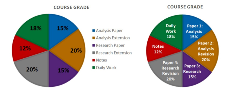
Use more than color to convey meaning
If color is used as the only method for conveying a message then individuals who are blind, color blind, or have low vision will not be able to perceive that information. For example, a person who is color blind may have trouble interpreting the chart on the left. The chart on the right uses location, in addition to color, to convey the data.
Meet required color contrast ratios
Your documents should follow the same AA WCAG 2.0 standards for contrast ratios as web content. This means a minimum 4.5:1 ratio for standard text, or a minimum 3:1 ratio for large text (18pt+).
To test contrast ratios, you can download a Color Contrast Analyzer or a Chrome plugin. These will allow you to use an eyedroper to select a foreground color and a background color, and will tell you the contrast ratio and whether or not it passes WCAG 2.0.
Embed accessible media
If you embed an audio, video, or multimedia file containing meaningful information, those files must also be accessible.
| Type of file | Must include | Term Definitions |
|---|---|---|
| Audio | Accurate and complete Transcript | A transcript is a text version of exactly what is being said in an audio file |
| Video (with no speech) | Accurate and complete text description | A description is a text version of what is happening in the video |
| Multimedia (audio and video) | Accurate and complete synchronized captions and audio descriptions |
Captions are time-synchronized text version of exactly what is being said, along with descriptions of relevant sounds. Audio descriptions are time-synchronized descriptions of what is happening. |